English
 日本語
日本語
 简体中文
简体中文
 繁體中文
繁體中文
 Italiano
 español
 Deutsch
 Русский

- Distinguish between tint, shade, and tone
- Apply principles of colour balance and contrast effectively
- Make informed colour choices in text and graphic design
레슨 상세 내용
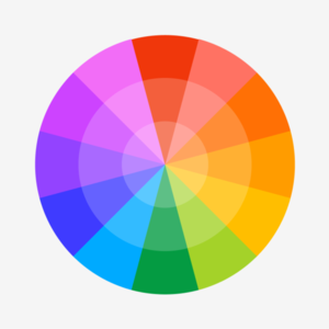
Now you have understood and can apply colour relationships using the colour wheel, students' will learn how to:
- Distinguish between tint, shade, and tone
- Apply principles of colour balance and contrast effectively
- Make informed colour choices in text and graphic design
You may follow along in a graphic or photo editing type application. (example Photoshop/ Affinity / Paint tool Sai / Microsoft paint.
Its probably easier in something like Adobe illustrator or Affinity Designer.
Though you can make your own colour wheel in any kind of software suitable for art and design. But you don't have to do that if you don't want to.
Its probably easier in something like Adobe illustrator or Affinity Designer.
Though you can make your own colour wheel in any kind of software suitable for art and design. But you don't have to do that if you don't want to.
Colour theory is essential because it’s the foundation of visual communication. Whether you're designing a logo, painting a portrait, or building a user interface, colour choices influence how people feel, what they notice, and how they interpret your message.
이 강사의 취소 방침
리퀘스트 확정 전
- 언제든 취소 가능
리퀘스트 확정 후
- 레슨 시작 24시간 이내→ 레슨 포인트의 100% 를 받고 있습니다.
- 노쇼→ 레슨 포인트의 100% 를 받고 있습니다.
이 강사의 다른 레슨
-
-
Colour Theory part one.
- Understand and apply colour relationships using the colour wheel - Identify and use complementary, analogous, triadic, square, and accent colour schemes디자인
 25분 1,300P
 -

Pronunication part 2 (and how to get the sound of native English.)
After the phonetic set and vowel we will move on to use of the phonics in words and where they sit. Double letter blends and vowel digraphs. Things to practice.영어
25분 1,300P -

Pronunciation part 1 (and how to get the sound of native English.)
Everyone can achieve the native sound of English following these points and in time with practice.영어
25분 1,300P